


Brandmanual

Brand story
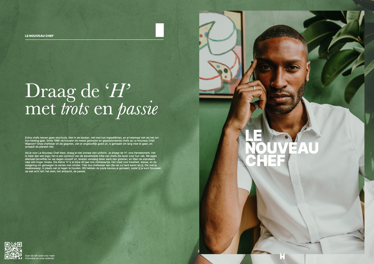
Our story
Fits like a dream, looks sharp as hell, and is built to last, without trashing the planet
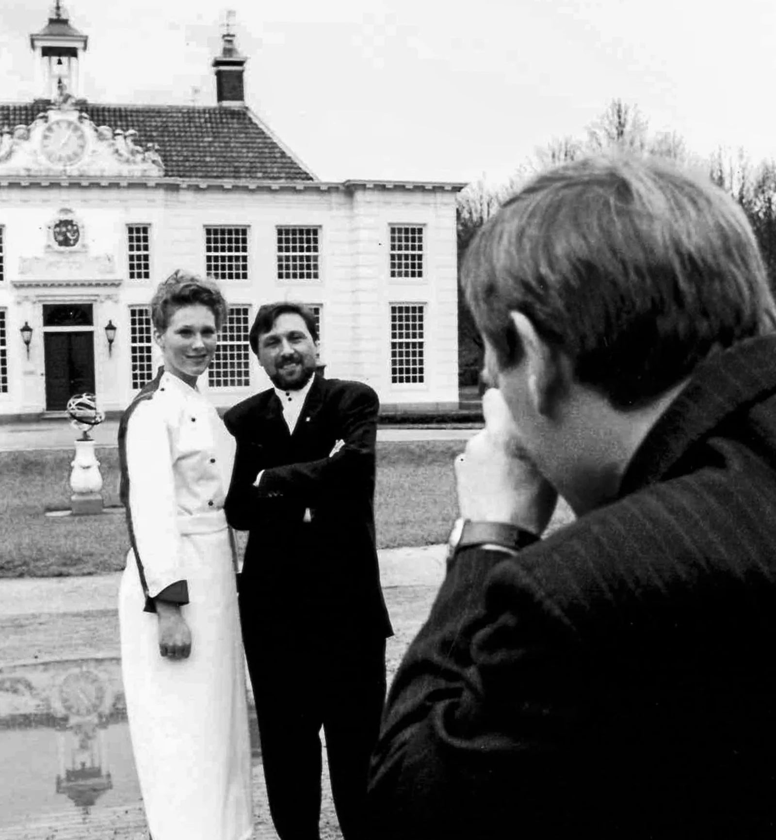
It all started with the simple idea to create distinctive attire, designed to support chefs during their daily grind in the bustling kitchen, something new with a fresh fit.
Since 1986, the most relentless, obsessed, and passionate chefs have turned to Le Nouveau Chef. Why? Because it fits like a dream, looks sharp as hell, and is built to last, without trashing the planet. Stylish, sustainable, and uncompromising.
When you choose Le Nouveau Chef, you’re not just wearing a uniform. You’re wearing the ‘H’, a badge of Honour. It’s more than a logo; it’s a symbol that says you’re part of something bigger: a global tribe of chefs who live and breathe the craft. We’re all chasing the same thing: to challenge harder, to create better, to elevate the game. That little ‘H’ has been our calling card for nearly 40 years. It’s a promise of quality, class, and a refusal to settle for anything less.
Mission
We honor the food, elevate the craft, and fuel your passion, suiting you in chefwear that’s as fearless and dedicated as you are.
Core values
Mastery
Mastery is the foundation of our brand. It’s about precision, patience, and passing on knowledge. We design for those who raise the bar in their kitchens, and in doing so, inspire others to grow.
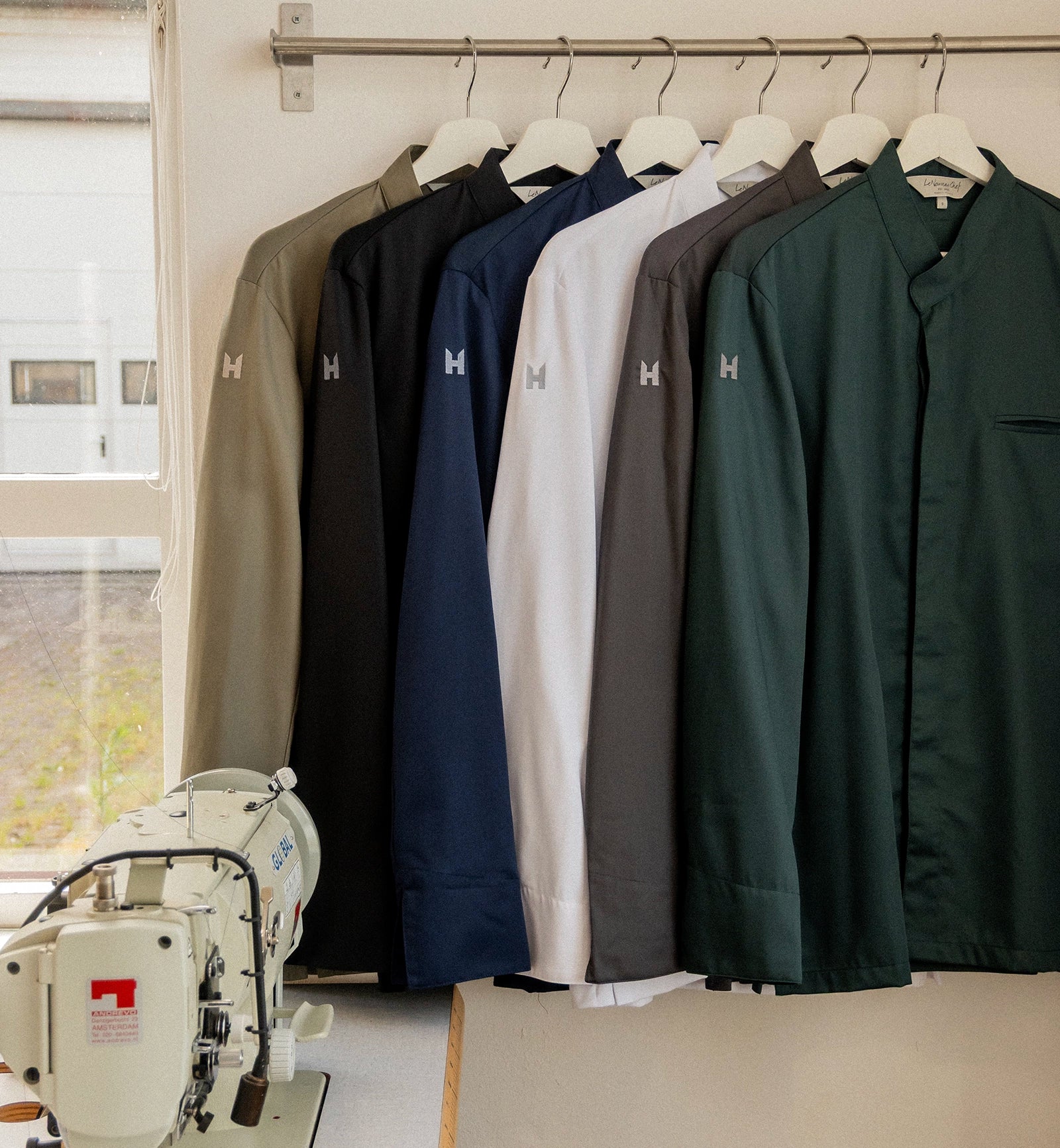
Quality
Since the beginning, we’ve worked with partners who share our standards. Selecting materials that support comfort in the kitchen, stand the test of time, and are produced with attention to people and process. Because chefs deserve clothing that performs as well as they do. We continuously explore new fabric innovations to raise the bar even further.
Innovation
Innovation is part of our heritage and our future. From our very first designs to our latest collections, we’ve stayed curious, about what’s next, and about what chefs truly need. Our team shares this mindset with our community: a commitment to refine, improve and evolve.
Innovation is part of our heritage and our future.
Responsibility & B Corp
“Every choice, whether in materials, design, or production partners, is the result of careful consideration and dedication.”
Le Nouveau Chef is officially a certified B Corp, which means we meet high standards in social and environmental impact, transparency, and accountability. To receive a B Corp certificate, companies are assessed on 200 criteria relating to social and sustainable impact. Le Nouveau Chef achieved a score of 111.1 points, placing us among the higher scores within the global B Corp community. We have this status, funnily enough, simply by doing what we consider normal: we treat our people well, work fairly with our suppliers, and produce everything sustainably and locally. We’ve been doing this for 40 years and now have official recognition for it.
- 111.1
Total B Impact Score - 80
Required for B Corp Certification - 50.9
Median Score for Regular Businesses

Brand Style
Logo
Primary logo
A combination of a classic wordmark and our H brand icon. Both the H icon and the wordmark are protected by copyright. The lettering style has a classic handwritten feel, emphasizing the hands and heart we put into everything we do. The subtitle underlines that we are an established name with years of experience.
Usage
- The primary logo colour is restricted to the LNC colour palette
- The primary logo is always placed centered
- Packaging
- Official documents
- Direct client and dealer communication
- Trade fair communication
- Digital applications such as presentations
Secondary logo: Icon + Wordmark
A combination of our iconic H icon and a more modern, bold wordmark.
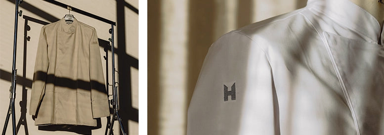
Icon
The H is derived from the last name of our founder, Robert ten Hoope. We still use this icon as a homage to our heritage and Robert’s continuous quest for quality and innovation.
Usage
- Always combined with the wordmark
- Small-scale applications
- Independently, when the brand is already clearly established
Wordmark
A bolder and more modern approach to our brand name. Easy to read and versatile. Both versions can be used depending on the layout.
Usage
- The colour can be derived from the image
- Always in combination with our icon
- Co-branding
- For bold or very small applications
- Advertising, both online and print
- Social communication & video campaigns
Typography
Uppercase subheading
A big and bold title combining regular and italic
An inter bodytekst. A strong and neutral typeface. Inter features a tall x-height to aid in readability of mixed-case and lower-case text. Several OpenType features are provided as well, like contextual alternates that adjusts punctuation depending on the shape of surrounding glyphs, slashed zero for when you need to disambiguate “0” from “o”, tabular numbers, etc.
A light inter is used for footnotes or image discription
Primary font: Baskerville
Regular
ABCDEFGHIJKLMNOPQRSTUVWXYZ
abcdefghijklmnopqrstuvwxyz
0123456789 .,;:!?“‘()/\|@#*&%
Italic
ABCDEFGHIJKLMNOPQRSTUVWXYZ
abcdefghijklmnopqrstuvwxyz
0123456789 .,;:!?“‘()/\|@#*&%
Secondary font: Inter
Light
ABCDEFGHIJKLMNOPQRSTUVWXYZ abcdefghijklmnopqrstuvwxyz 0123456789
Regular
ABCDEFGHIJKLMNOPQRSTUVWXYZ abcdefghijklmnopqrstuvwxyz 0123456789
Medium
ABCDEFGHIJKLMNOPQRSTUVWXYZ abcdefghijklmnopqrstuvwxyz 0123456789
Semibold
ABCDEFGHIJKLMNOPQRSTUVWXYZ abcdefghijklmnopqrstuvwxyz 0123456789
- Title main font / Baskerville regular
- Letter case: Sentence case
Font size: Scalable
Tracking: −25 (relative to 1/1000 em)
Leading: 84% of font size (print) · 90% (online) - Title emphasis style / Baskerville Italic
- Letter case: Sentence case
Font size: Use at 103% of the Regular font size when both are used, for optical consistency. Always adjust visually when necessary.
Tracking: 0 (relative to 1/1000 em)
Leading: 84% of font size (print) · 90% (online)
- Bodytekst Subheading / Inter Medium/Semibold
- Letter case: Upper case
Font size: 8 pt (print) · 28 pt (online)
Tracking: +50 (relative to 1/1000 em) - Bodytekst main / Inter Regular
- Letter case: Sentence case
Font size: 8 pt (print) · 32 pt (online)
Tracking: 0
Leading: 140% of font size - Bodytekst Section divider / Inter Semibold
- Letter case: Sentence case
Tracking: 0
Leading: 140% of font size - Bodytekst Lead-in / Inter Medium
- Letter case: Sentence case
Tracking: 0
Leading: 140% of font size - Footnote / Inter light
- Letter case: Sentence case
Font size: 7
Tracking: 0
Leading: 140% of font size
Colours
A muted palette
We work ton-sur-ton to maintain balance and a luxury feel. To add warmth and depth within our graphic design, we extract colours from photography and integrate them into our layouts. This allows for creative flexibility, while staying true to our visual identity. Any colours derived from imagery must align with our slightly unsaturated and natural palette.
Designed to be Felt
We emphasise tactility and aim to create imagery that feels layered and tangible. To evoke this sense of depth, we incorporate subtle grain and gradients throughout our design work.
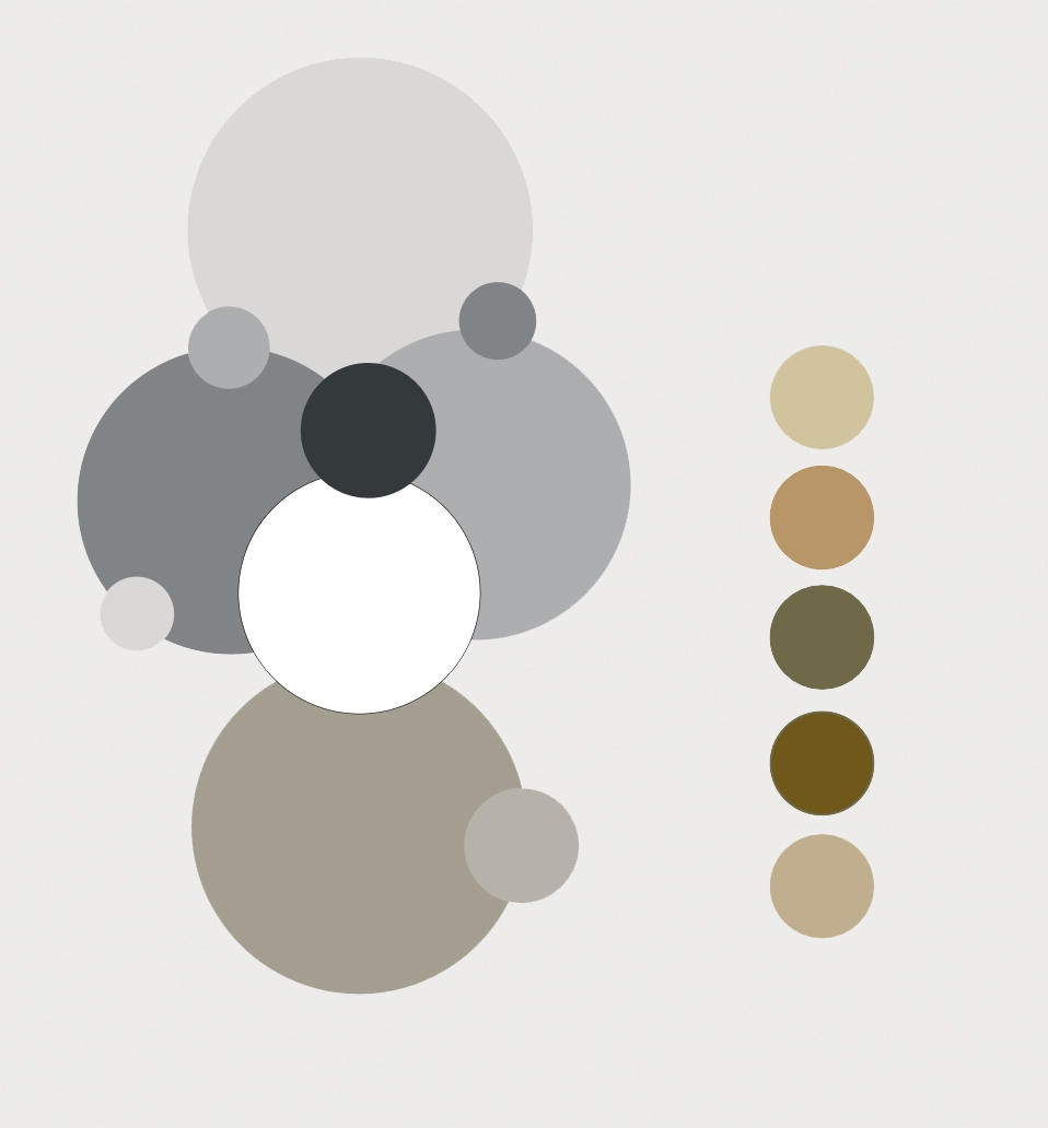
LNC-Coolgrey 1U
#D9D8D6
LNC-Coolgrey 5U
#ACADAF
LNC-Coolgrey 10U
#828386
LNC-Dark
#34393C
LNC-402U
#A49F92
LNC-Light
#ffffff
Design language
Layering
We use text placed on top of, or partially over, imagery to add visual depth.
Huge H
Our signature H is scaled up dramatically to serve as a visual anchor. Text is aligned along its contours to create rhythm and balance within the composition.
Image style
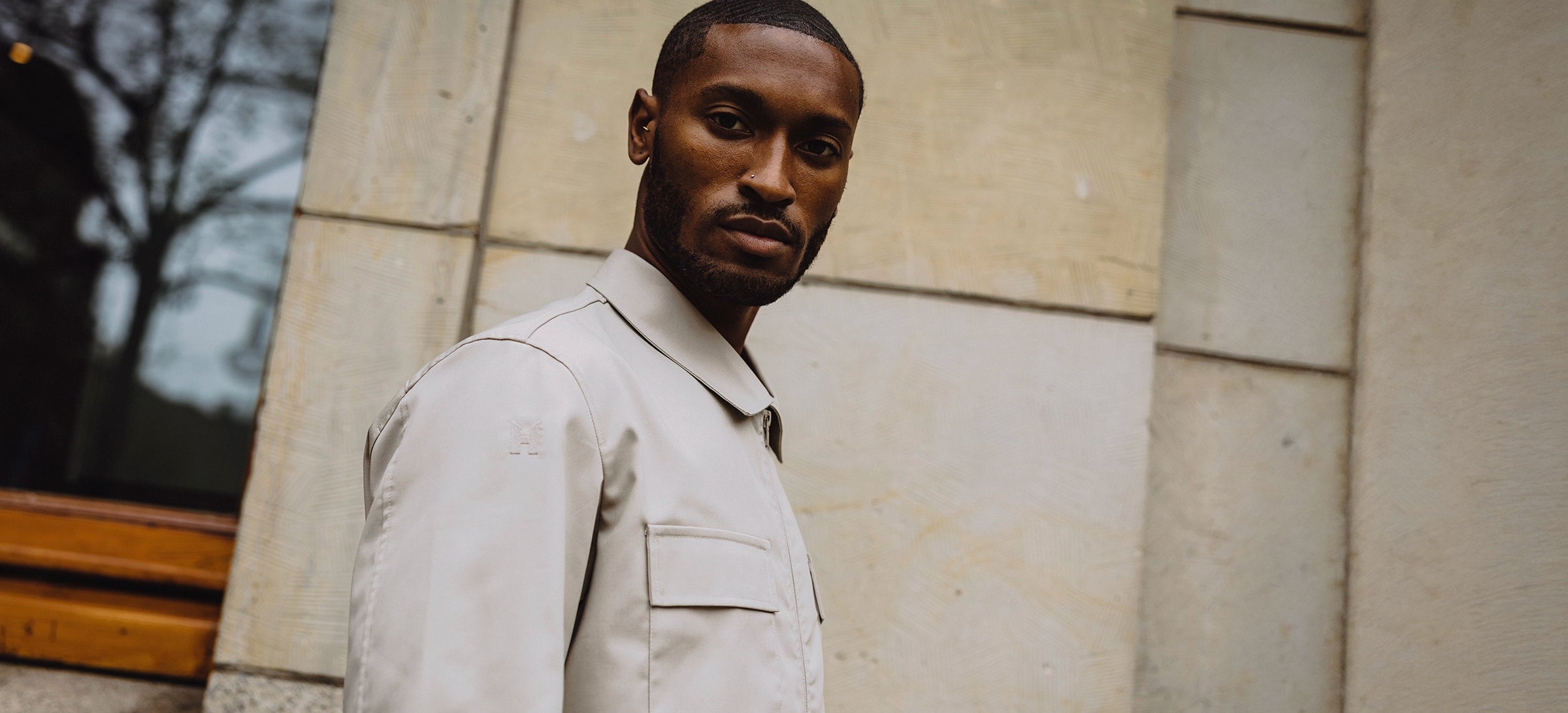
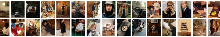
Tone & Style
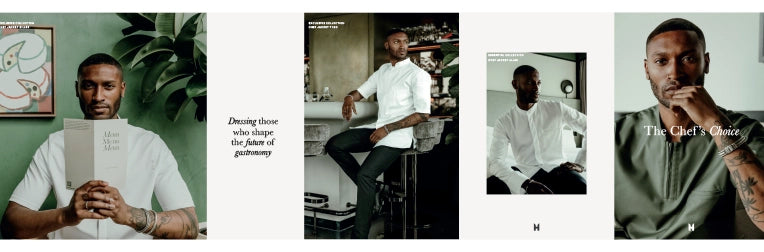
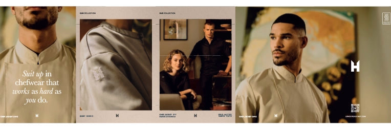
We use photography that feels authentic, natural, and close to the subject. It is a mix of fashion and documentary style photography. Focussing on real moments, craftsmanship, and material textures. Lighting should be soft and directional, avoiding hard flash or over-editing. We always add grain for a tactile, cinematic look. And apply a subtle warm tone to avoid a sterile or cold look. The colours are slightly desaturated for a natural and timeless look.
Signature Visual Elements
To create brand recognition and visual consistency, we reuse visual style elements across different campaigns.
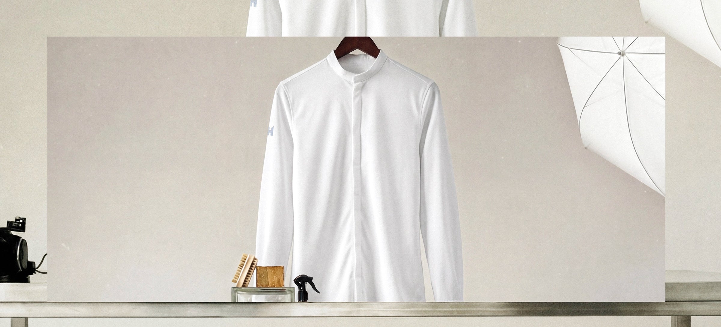
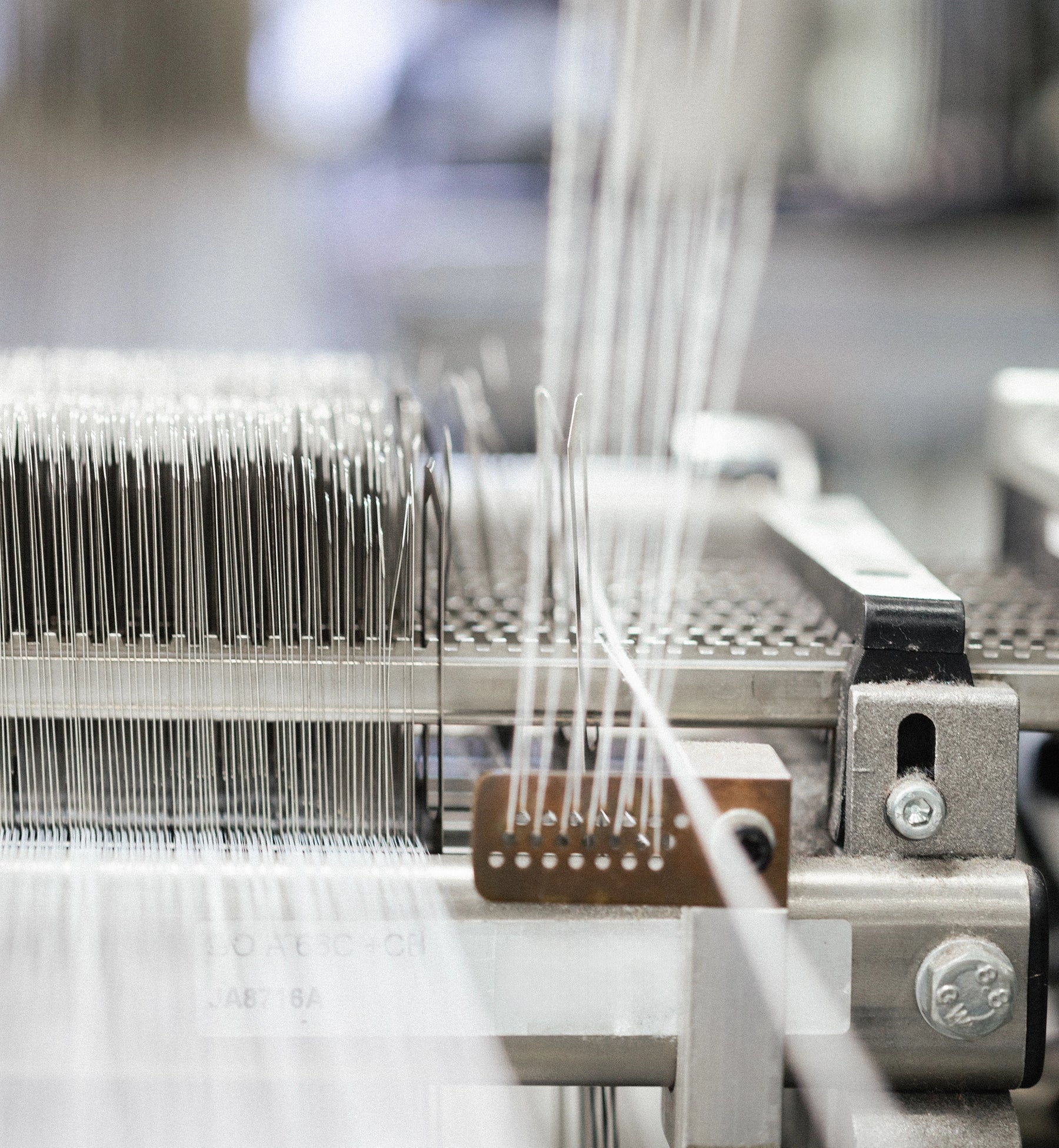
- Texture focus — Emphasize surfaces and tactile elements (fabrics, brushed steel, food textures) to bring depth and realism.
- Overhead shots/Flatlays — Overhead shots of ingredients, materials, tools or handlings to create rythm and show fun and creativity.
- Frame-in-frame — Scenes captured through windows, cutouts or bordered views to pull the viewer in.
- Stainless steel (RVS) — It matches the culinary style, creates contrast combined with more retro and natural materials with more texture.
- Limited colour scheme — During every shoot we work with a limited colour scheme alligned with the concept/brand palette.
Focussing on real moments, craftsmanship, and material textures.